Portfolio Menu

Structuring Brand Language for Long Term Growth

Verdant Branding Sytem + Creative Direction 2025

Verdant Logo on a wooden wall with custom lighting

Brand Strategy & Messaging for a Sustainable Home Brand

Nature Inspired Branding for a Handmade Crafts Shop

Key Results

0 H
Design Time
0
Strategy Rounds
0 +
Messaging Refinements
0
Core Framework Elements
0
Brand Pillars Defined

Established clear and defensible market positioning


Directed and refined messaging into a cohesive brand voice

Built a scalable identity system for long term growth

+ 0 %

increase in shop traffic

Balanced two contrasting style preferences into one cohesive brand

Designed a scalable logo for use across packaging and digital

Need structure before scaling your brand? Let’s build the foundation properly.

Project Overview

Verdant is a sustainable home goods brand built around eco conscious materials and intentional living. While the product vision was clear, the brand expression lacked structure. Early messaging varied in tone and positioning, and the visual language did not yet reflect the maturity of the offering. The objective was to define a cohesive brand foundation that could scale with the business.

My Role

Creative Director · Brand Strategy & Identity
Brand positioning, messaging architecture, visual identity development, logo system, typography, colour palette, pattern design, brand voice refinement, usage guidelines.
Directed and refined initial copy draft produced by junior writer.

Verdant - Everyday essentials. Consciously made.
Examples of Verdant Microcopy
Verdant Visual Identity typography

Challenges

• Positioning lacked clear differentiation within the sustainable home goods market
• Messaging varied in tone and structure
• No established visual identity system
• Needed to balance eco warmth with product credibility
• Early ideas required refinement without losing authenticity

Solution

Developed an integrated brand system combining strategic positioning, structured messaging, and cohesive visual identity.
• Defined clear and defensible market positioning
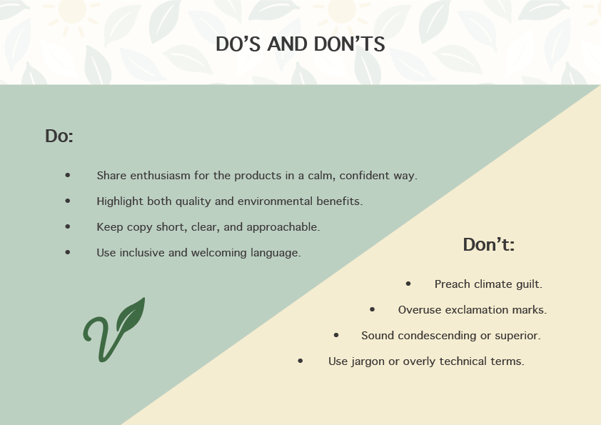
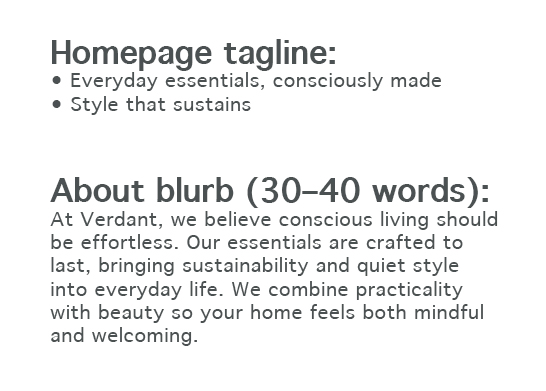
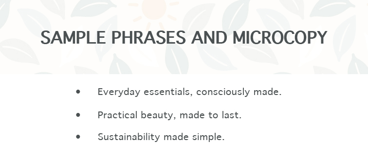
• Built structured messaging tiers and voice guidelines
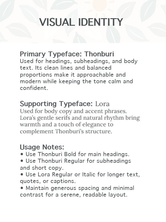
• Designed logo system and visual identity elements
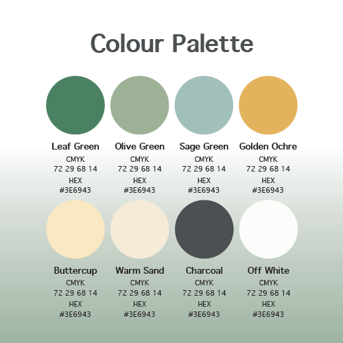
• Established typography hierarchy and colour framework
• Created a brand guide outlining usage rules and messaging principles
The result was a unified brand system ready for consistent implementation.

Process

  • Strategic Positioning Clarified audience, differentiation, and core value proposition.

     
  • Messaging Structuring Reviewed the initial draft, removed redundancies, strengthened differentiation, and rebuilt hierarchy.

  • Visual Identity Creation Designed logo mark and variations, selected typography, defined colour palette, and developed a supporting pattern system.

     
  • Brand System Documentation Created a concise guide outlining voice principles, messaging tiers, typography rules, and visual application guidelines.

     
  • Iterative Refinement Conducted multiple refinement rounds with the founder to ensure clarity and alignment.

Do's and Don't's of Verdant Copy and Branding
Verdant Tagline and About blurb

Results

  • Defensible positioning within the sustainable home goods space

  • Cohesive and scalable messaging framework

  • Complete visual identity system

  • Documented brand guidelines for consistent future use

  • Increased confidence in brand expression and direction

Reflection

Leading Verdant required balancing refinement with preservation. The goal was not to replace the founder’s vision, but to structure it.

Strategic editing, visual cohesion, and documented guidelines transformed early ideas into a scalable brand system.

Messaging Structure & Refinement

The initial copy draft provided a strong starting point but lacked hierarchy and differentiation. I restructured the content into clear messaging tiers, defining a primary positioning statement supported by secondary value pillars and functional proof points.

Tone was carefully refined to balance warmth with credibility. As a sustainable home brand, Verdant needed to feel environmentally conscious without sounding performative or overly technical. The final voice principles prioritised clarity, restraint, and confidence.

Visual Identity Decisions

The visual identity was designed to reflect natural materials while maintaining commercial maturity. The logo system balances softness with structure, avoiding overly rustic or handcrafted aesthetics that could limit scalability.

Typography selection focused on legibility and tonal balance. Pairings were chosen to support both storytelling and product presentation. The colour palette draws from organic references while maintaining enough contrast for digital and print applications.

The supporting pattern system was developed from core brand shapes to create cohesion across packaging and promotional materials without overwhelming the product.

Verdant Palette layout

Brand Guide Development

While not a lengthy formal document, the brand guide outlined essential visual and messaging rules to ensure consistency moving forward.

It included:
• Logo usage and spacing
• Typography hierarchy
• Colour applications
• Voice principles
• Messaging tiers
• Application examples

The goal was to provide enough structure to prevent drift, while keeping the system flexible for growth.

Strategic Takeaway

Verdant demonstrates how early structural decisions compound over time. Establishing positioning, refining language, and aligning visual systems before scale reduces friction later.

This project reinforced the importance of integrating strategy and identity rather than treating them as separate phases.

Building a brand that needs structure before scale? Let’s create the foundation together.