The Elementals is a concept-driven identity system built to explore how historical symbolism can be translated into a cohesive modern visual language. The project focuses on the five classical elements of alchemy, reinterpreting their meaning through structured iconography, illustration, and consistent visual rules.
My Role
Illustration Designer
Extensive research into alchemical symbolism and elemental archetypes, character illustration development, structured colour logic tied to each element, geometric composition planning, and cohesive visual consistency informed by historical reference.
Challenges
Alchemy is rich in symbolism, but much of it is inconsistent, abstract, or visually fragmented across sources.
The challenge was to:
Translate complex, often contradictory symbolism into a unified system
Maintain historical integrity without creating something that feels outdated
Ensure each element feels distinct while still belonging to the same visual language
Solution
I developed a structured identity system where each element is built from a shared visual foundation, then differentiated through form, balance, and symbolic detail.
This approach ensured:
Consistency across all elements
Clear visual hierarchy and recognisability
A modern execution rooted in historical reference
Process
Research
Studied alchemical texts and symbolic interpretations
Analysed historical representations of elemental forms
Identified recurring patterns and inconsistencies
System Building
Established a base visual framework for all elements
Defined rules for line, shape, and proportion
Created a repeatable structure for expansion
Design & Iteration
Developed multiple directions for each element
Refined balance between symbolism and readability
Iterated toward a cohesive final set
Results
The final outcome is a cohesive identity system that translates historical symbolism into a structured, modern visual language.
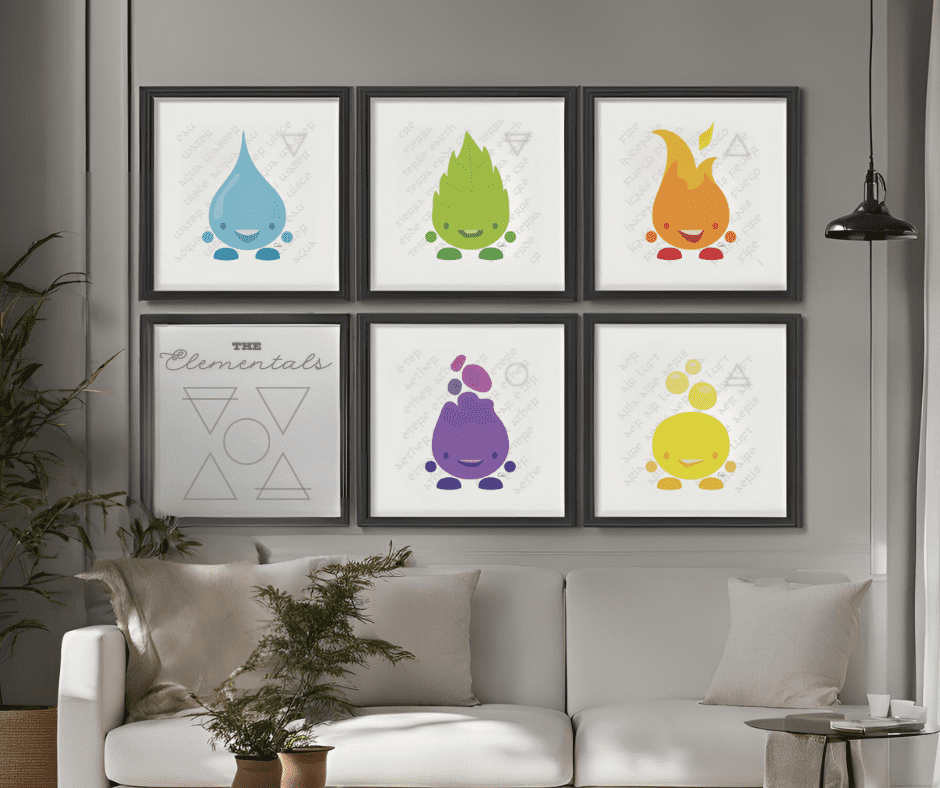
Each element stands independently while functioning as part of a larger system, making the work scalable for future applications such as digital products, editorial use, or branded environments.
Reflection
This project reinforced the importance of building systems rather than isolated visuals.
Establishing clear rules early made it easier to maintain consistency across multiple elements while still allowing each one to feel distinct. It also highlighted how small decisions, especially around colour and form, can significantly impact how a system reads as a whole.
The approach taken here translates directly to brand and product work, where scalability and consistency are just as critical as the initial visual direction.
Dive Deeper into the Process
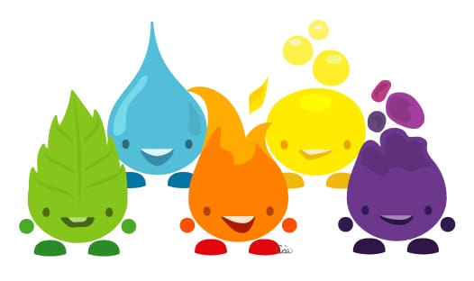
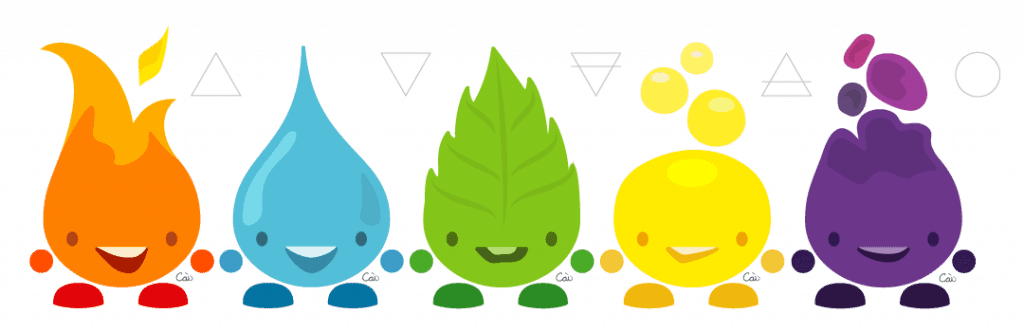
The Elementals was built around the idea of translating symbolic systems into a structured visual language.
Each element required balancing recognisability with abstraction. Rather than relying on literal representations, the focus was on distilling each element down to its most essential characteristics, then expressing those through consistent form and visual rules.
Colour played a critical role in differentiation. Fire, Water, and Earth followed more expected associations, while Air required a more deliberate decision to avoid overlap. A yellow palette was introduced to maintain distinction without breaking the overall system.
Spirit presented a different challenge entirely. As a less tangible concept, its visual direction leaned into contrast and depth, using darker tones to separate it from the more grounded elements while still maintaining cohesion.
Although the work was initially developed as a contained set, the system was designed with scalability in mind, allowing for expansion into additional elements, variations, or applications without compromising consistency.
When your visuals need to work as a system, not just stand alone.