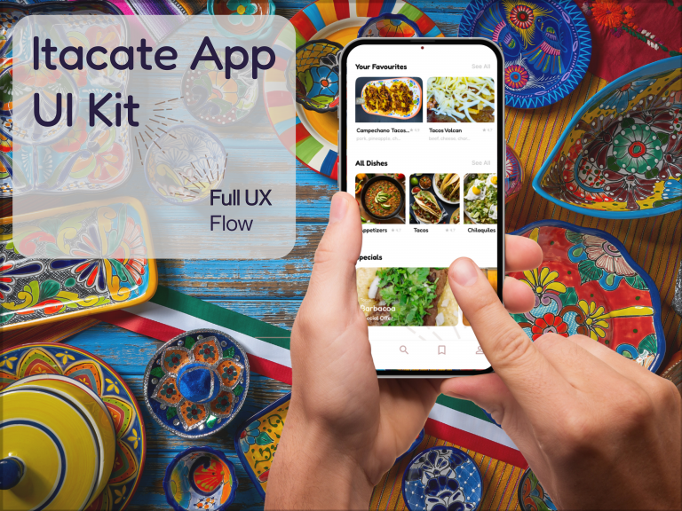
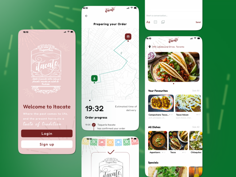
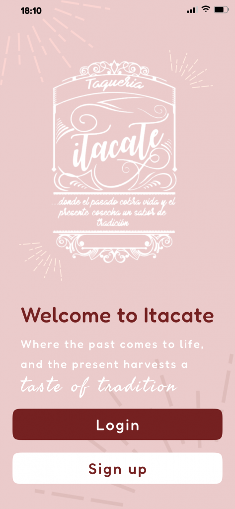
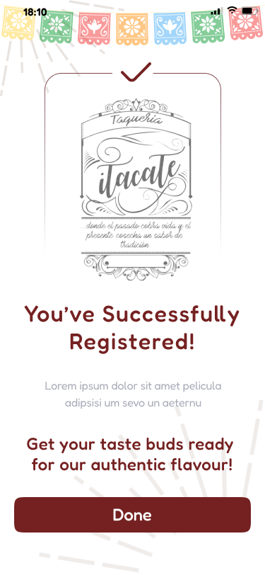
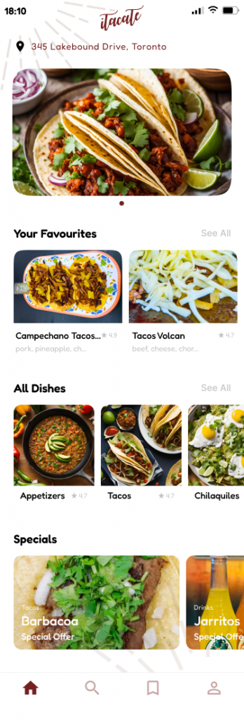
Portfolio Menu

Itacate – App UI/UX

UX/UI design for a small taquería’s delivery app

A Luxurious Identity for a Travel Brand

Key Results

0 H
Time to Complete
0
UX/UI Frames Designed
0
Time Lapse Record
0
Iterations
0 %
Brand Created

Designed a full bilingual ordering app that blends culture, convenience, and UX best practices

Created a mobile-first experience optimised for real users with accessibility and clarity in mind

Delivered a complete UI prototype with ordering flow, tracking screen, and responsive interface

Designed a premium travel brand logo with an emphasis on luxury and exploration

Created a compass-inspired mark symbolizing adventure and sophistication

Developed a time-lapse video showcasing the entire Illustrator design process

Let’s create food-focused UX that speaks to your audience.

Project Overview

Itacate is a real Mexican taquería in Toronto. This mobile app was designed to help them expand their customer experience through a clean, intuitive digital ordering solution that reflects cultural identity, supports bilingual use, and simplifies food selection, checkout, and delivery.

My Role

UX Designer · UI Designer
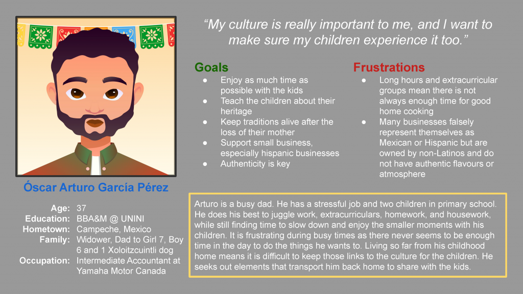
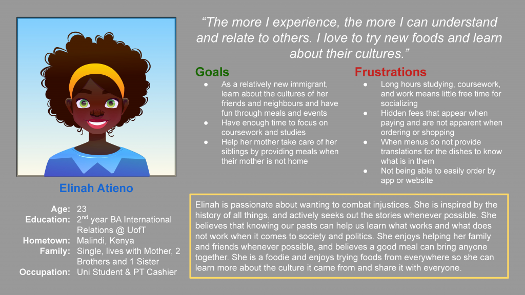
Led all research, user interviews, persona creation, journey mapping, wireframing, UI design, prototyping, and testing in Figma.

Challenges

  • No existing digital ordering system

  • Third-party apps lacked cultural branding and full UX control

  • Users struggled with unclear menus, lengthy checkout flows, and a lack of bilingual support

Tools Used

Figma · Illustrator · Google Docs
Used component-driven design and built a clean UX structure with user-first logic.

Solution

  • Created a complete UX flow with 60 high-fidelity Figma screens

  • Designed a culturally respectful interface with bilingual clarity

  • Ensured accessibility with WCAG-compliant text and spacing

  • Built consistent, scalable design components

  • Developed a fully mapped interactive prototype for testing

Process

  • Research: Conducted a competitive audit comparing 4 similar apps, noting accessibility gaps, language limitations, and visual clutter

  • Personas: Developed user profiles including busy parent “Óscar” and student foodie “Elinah” with diverse needs and pain points

  • Journey Mapping: Tracked emotional journeys across ordering tasks to identify improvement areas

  • Design: Built mobile-first wireframes leading to 60 polished frames, focusing on intuitive interactions and clear visual hierarchy

  • Testing: Ran two usability test rounds with five participants, then refined navigation, labelling, and tap targets

Results

  • Delivered 60 screens spanning home, menu, cart, checkout, delivery tracking, login and more

  • Simplified order flow to just 3 key steps from selection to confirmation

  • Fully bilingual UI (English and Spanish)

  • Optimised for low-vision users and new app users

  • App structure is prepared for future additions like loyalty programs and admin dashboards

Client Feedback

“I’d actually use this app to order tacos. It feels easy — I know exactly where to click.”
Usability Testing Participant

Design Intentions

  • Used bold, warm tones and iconography rooted in Mexican culture

  • Created seamless UX in both light and dark modes

  • Typography balances readability with style for branding

Accessibility & Inclusion

  • High-contrast design and readable font sizes

  • Tap-friendly navigation for mobile and small-screen devices

  • Screen flows designed to avoid cognitive overload

Competitive Audit Insights

  • Most competitors used third-party apps with limited customisation and no bilingual UX【32】

  • No direct competitors offered both cultural identity and user-friendly ordering in a single system

  • Found opportunities in accessibility, customisation, and checkout clarity

Future Improvements

  • Enable group ordering and saved orders

  • Add promo codes and dietary filters

  • Design backend tools for restaurant staff


Like this design direction? Let’s build something delicious together.