Portfolio Menu

Acorn Woods – Handmade Branding for a Small Business

Nature-Inspired Branding for a Handmade Crafts Shop

Branding for a Crafts Shop

Key Results

0 H
Design Time
0
Sketches Done
0
Style Rounds
0
Custom Palette​
0
Client Feedback
+ 0 %

increase in shop traffic

Balanced two contrasting style preferences into one cohesive brand

Designed a scalable logo for use across packaging and digital

+ 0 %

increase in shop traffic

Balanced two contrasting style preferences into one cohesive brand

Designed a scalable logo for use across packaging and digital

Want branding that gets noticed? 

Let’s Build Your Brand Together!

Project Overview

Acorn Woods was a branding project for a handmade crafts Etsy shop. The goal was to create a cohesive brand identity that reflected the rustic charm and modern aesthetics of the shop. This included designing a logo, selecting fonts, and creating a colour palette.

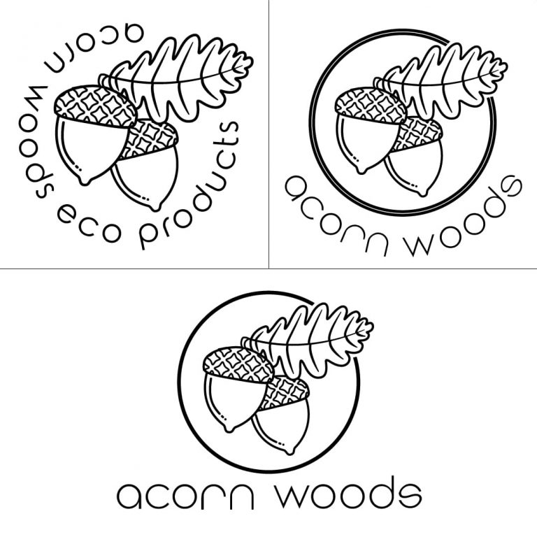
Line art versions of the Acorn Woods logo iterations from different steps of the process, ultimately, elements from these were incorporated into the final version.

Challenges

The biggest challenge was balancing the contrasting style preferences of the two shop owners. One preferred vibrant, modern tones, while the other leaned toward muted, traditional aesthetics. Merging these into a unified identity required multiple iterations.
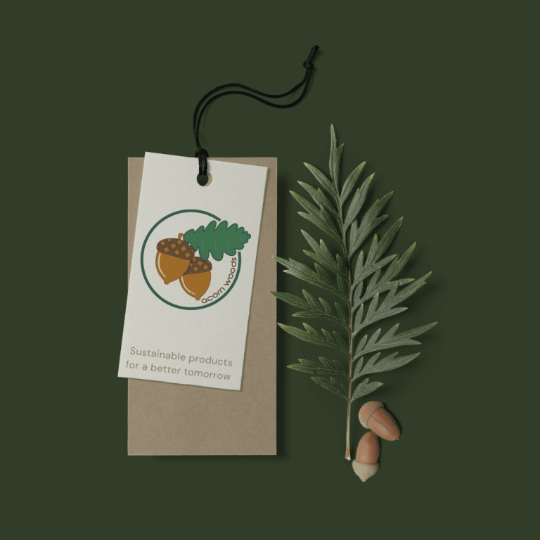
Acorn Wood Logo displayed on Sales Tags along side a pair of acorns and a fern leaf

Solution

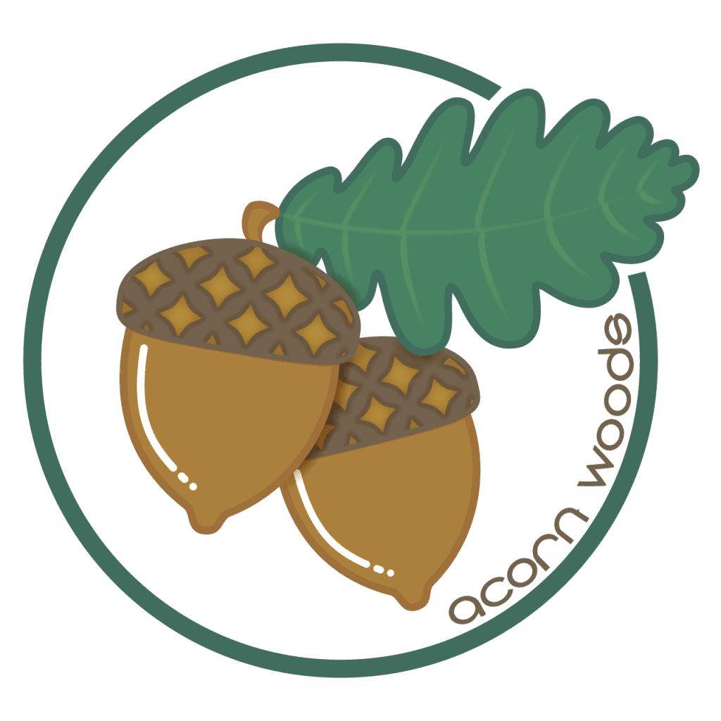
Through extensive collaboration and iteration, I developed a logo that combined vibrant oak leaves with a rustic, modern design. A carefully curated font and colour palette complemented the logo to create a harmonious visual identity.

Process

  • Discovery Meetings: Conducted consultations with the shop owners to align on design priorities and preferences.

  • Font & Colour Selection: Explored modern serif fonts paired with earthy tones to balance the traditional and modern aesthetics.

  • Logo Iteration: Designed several concepts before finalizing a logo that resonated with both stakeholders.

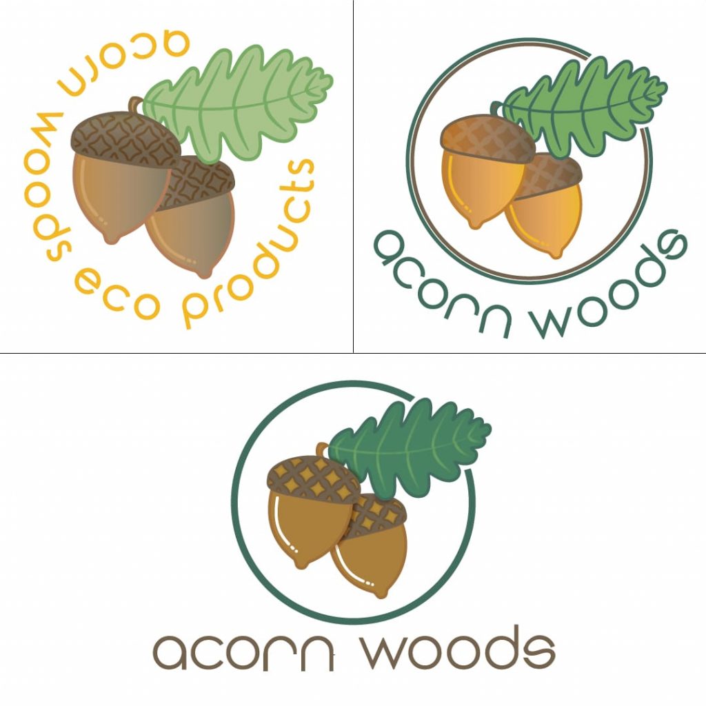
Coloured versions of the Acorn Woods logo iterations from different steps of the process, ultimately, elements from these were incorporated into the final version.

Results

  • Increased shop traffic by 15% within three months of rebranding.

  • Improved brand recognition among the Etsy community.

Client Feedback

Cai’s patience and creativity were invaluable in creating a brand that we both love. It’s perfect!

The design process for Acorn Woods involved balancing two distinct visual preferences. I began with brainstorming sessions to understand each owner’s vision. Early sketches ranged from whimsical to minimalistic, and I encouraged open feedback to refine the direction. After finalizing the logo, I crafted a brand guide that outlined logo usage, font pairings, and colour applications for product tags, social media, and shop banners. This collaborative effort ensured the branding captured the heart of the shop’s identity.

Want branding that gets noticed? 

Let’s Build Your Brand Together!