Project Overview
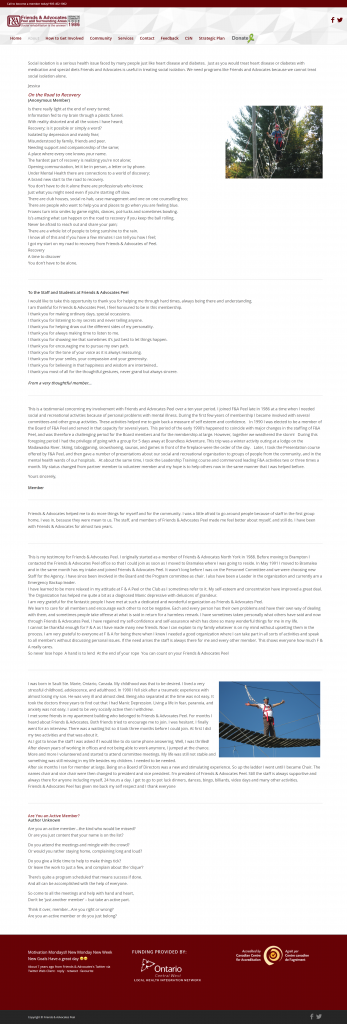
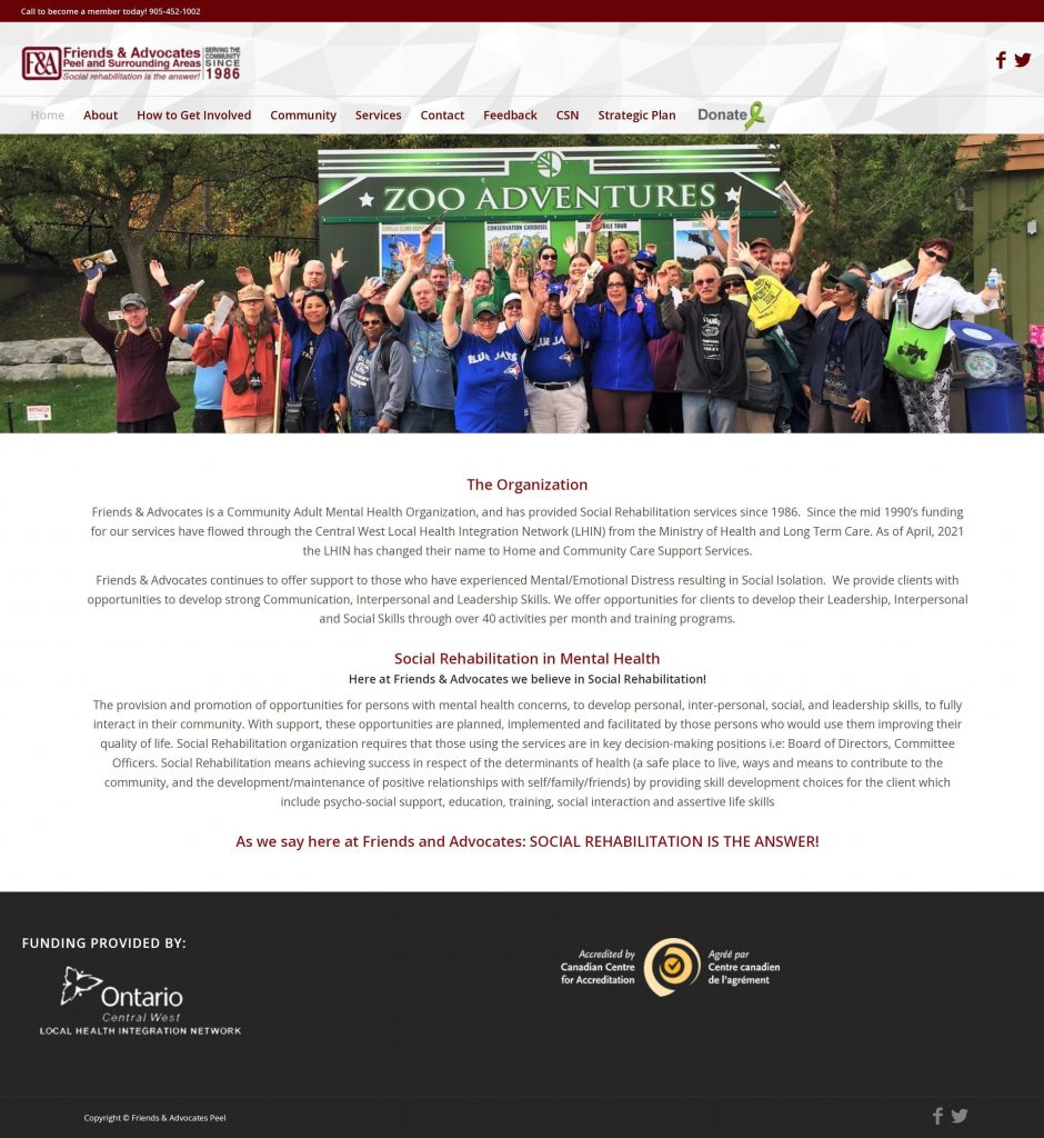
Friends & Advocates needed a website redesign that met AODA accessibility standards while improving user engagement and clarity. The organization, which provides community support for individuals with mental health challenges, required a platform that was easy to navigate for all users, including those with disabilities.
My Role
Lead UX/UI Designer & WordPress Builder
Information architecture restructuring, accessibility alignment, visual redesign, content hierarchy refinement, multi-page implementation, stakeholder collaboration, and post-launch training support.