Portfolio Menu

Building brand infrastructure for a healthcare focused B2B tech company

Life Image Media BRAND SYSTEMS · B2B

A Unified Visual System for institutional growth

A Luxurious Identity for a Travel Brand

Key Results

0 +
Brand Assets
0 +
Sales Pieces
0 +
Product Surfaces
0
Output Formats
~ 0
Week Engagement

Strengthened brand perception across healthcare and commercial environments, supporting structured B2B sales efforts.

Unified print, product, and presentation materials under a cohesive visual system, reducing fragmentation.

Established adaptable brand standards that supported product growth and evolving marketing needs.

Designed a premium travel brand logo with an emphasis on luxury and exploration

Created a compass-inspired mark symbolizing adventure and sophistication

Developed a time-lapse video showcasing the entire Illustrator design process

Let’s create a brilliant brand system that speaks to your audience.

Project Overview

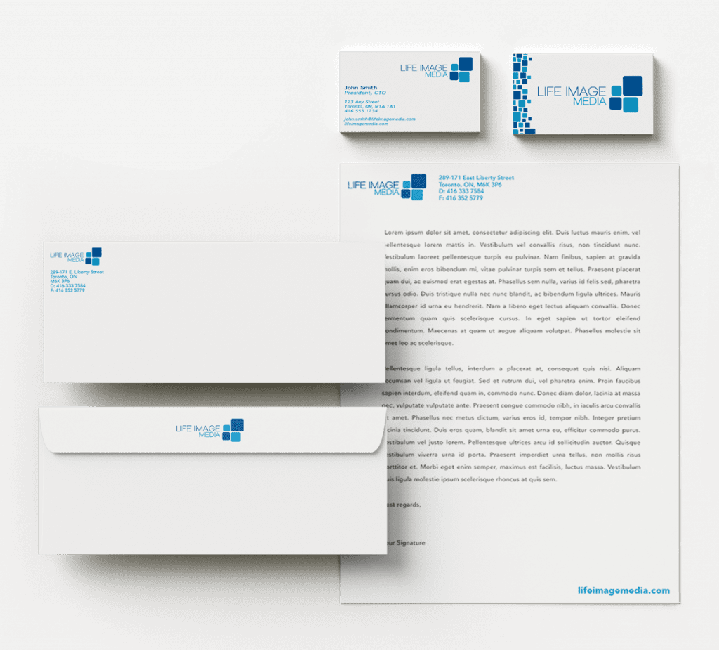
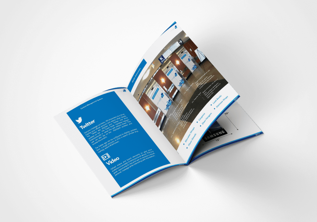
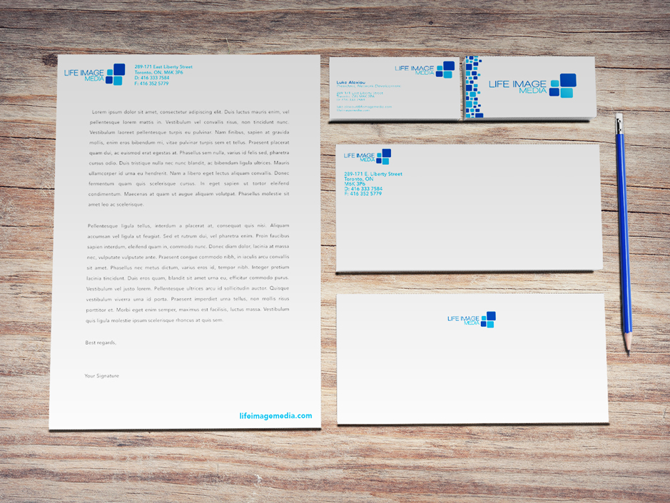
Life Image Media is a Toronto-based B2B tech company producing branded charging stations and digital display units for healthcare and commercial environments. The project focused on establishing a cohesive brand system that could scale across print collateral, product surfaces, and sales materials. The goal was to create visual clarity and consistency within institutional settings where trust and professionalism are critical.

My Role

Graphic Designer · Brand Development
Brand system development, sales enablement materials, product surface applications, and visual standardization across print and presentation formats.

LIM stationary - branding of business cards, envelopes, and letterhead

Challenges

  • The primary challenge was building visual cohesion within an early-stage B2B environment operating in healthcare settings.
  • Establishing a recognizable visual language from limited existing assets
  • Ensuring clarity and professionalism suitable for institutional spaces
  • Creating a repeatable pattern system that could scale across materials
  • Maintaining consistency across print, product, and presentation formats
  • Balancing visual impact with functional documentation needs

Tools Used

Illustrator · InDesign · Photoshop · Acrobat Pro · Microsoft Word · PowerPoint
Primary tools included Illustrator for pattern and asset development, InDesign for structured documentation, and Photoshop for visual refinement.
Life Image Media look book mockup with descriptions and an image of the devices and advertising potential in realistic settings

Solution

The solution centered on creating a cohesive visual framework that could scale across documentation, product surfaces, and sales materials.

  • Developed a modular square-based pattern system using core brand colours

  • Established spacing and layout logic to ensure consistency across formats

  • Applied the system across stationery, brochures, presentations, and product graphics

  • Designed reusable document templates for internal and sales use

  • Ensured adaptability across Adobe and Microsoft environments

Process

  • Visual Language Development: Created a repeatable square-based pattern system that formed the core visual anchor of the brand.
  • Layout Standardization: Defined spacing, alignment, and hierarchy rules to maintain cohesion across documentation.
  • Cross-Platform Adaptation: Translated the brand system into reusable templates across Acrobat, Word, and PowerPoint.
  • Product Application: Applied visual elements to large-format charging station surfaces and display units.
Life Image Media brochures stacked

Results

  • Established a cohesive visual identity across all brand assets

  • Improved consistency across sales and presentation materials

  • Created reusable templates that reduced future design fragmentation

  • Strengthened institutional brand perception in healthcare environments

  • Provided a scalable visual foundation for ongoing growth

Reflection

This project reinforced that brand strength is not defined by logo execution alone, but by the clarity and repeatability of its visual logic. Establishing a modular pattern system created cohesion across product, print, and presentation environments while maintaining flexibility for future growth.

Designing across both Adobe and Microsoft platforms also emphasized the importance of operational usability. A brand system must function not only visually, but practically within the tools teams rely on daily. Building for real-world implementation ensured consistency could be maintained beyond the initial design phase.

Like this design direction? Let’s create a solid system together.