Portfolio Menu

Rhema Foundation Can. – Interactive & Engaging Website Design

Interactive & Engaging Website for a Non-Profit Organization

Engaging Website for a Non-Profit

Key Results

0 H
Time to Complete
0 H
Chats with Client
0
Revisions Made
0
Problems Solved
0 %
Client Happiness
%

Completed a partially developed website, adding full visual and interactive elements

Created an engaging and donation-friendly design using bold branding colours

Ensured responsive functionality for a wide range of devices

Completed a partially developed website, adding full visual and interactive elements

Created an engaging and donation-friendly design using bold branding colours

Ensured responsive function

for a wide variety of devices

Let’s Build a Website That Makes an Impact!

Project Overview

The Rhema Foundation’s website project was handed off to me and a developer after another team abandoned it at 30% completion. The WordPress setup and a basic framework were in place, but the project lacked visuals, interactivity, and a polished, user-friendly layout. My role was to finalize the entire web design, ensure responsiveness across devices, and introduce interactive elements to enhance engagement.

The Rhema Foundation Website on various devices
Rhema Foundation Canada Mobile View

Challenges

The foundation’s previous design team failed to communicate effectively with the client, leaving their vision unrealized. The branding had been inconsistently applied, and the existing framework lacked the necessary engagement features to support their outreach efforts. Additionally, the donation process was not fully set up, which made it difficult for supporters to contribute.

Solution

To address these issues, I focused on creating a visually engaging and user-friendly experience. I refined the site’s visuals using the organization’s branding colours to highlight key content while keeping the layout clean and easy to navigate. I introduced interactive elements, including scroll-triggered number counters and call-to-action buttons, to improve engagement. The donation page was also optimized by linking their accounts for seamless transaction processing. Finally, I adjusted the CSS styling to ensure mobile-friendly layouts and cross-browser compatibility.

The Rhema Foundation Investments Page Mobile Design Layout
The Rhema Foundation Homepage Design Links for Donation, Values, Mission, etc.

Process

  • Evaluated Existing Work: Reviewed the incomplete project to identify gaps and missing components.

  • Wireframing & Design Execution: Built page layouts, focusing on clarity, engagement, and ease of navigation.

  • Brand Integration: Applied the foundation’s bold colours strategically to draw attention to headlines and key messages.

  • Responsive Testing: Ensured the site worked seamlessly on mobile, tablets, and desktops.

Results

  • The completed website improved visibility and donor engagement, allowing the foundation to connect with supporters more effectively.

  • The foundation could now collect donations more easily, thanks to a user-friendly payment system.

  • The site remains live and fully functional today, continuing to support the foundation’s mission.

Client Feedback

The transformation of our website has been incredible. It now reflects the professionalism and mission of our foundation, and we’re so grateful for the ability to better connect with our supporters!

When I inherited the Rhema Foundation project, it was barely functional, with only a WordPress install and minimal structure. My goal was to turn an incomplete project into a fully operational and visually compelling website.


The biggest challenge was revitalizing trust with the client, who had experienced setbacks with the previous team. By focusing on clear communication and design transparency, I ensured the site reflected the foundation’s vision and values.


The Rhema Foundation Homepage Design Impact module of animated scrolling numbers

Key design considerations included:

  • Bold Colour Use: Used the organization’s colours strategically to create clear visual hierarchy.
  • User-Friendly Interactions: Added scroll-triggered counters to highlight achievements.
  • Mobile-First Design: Optimized every section for a seamless experience across devices.

Today, the foundation continues to leverage the site for outreach and donations, proving that a well-structured website is a powerful tool for non-profits.

Key Moments

  • Received the partially built site from the previous design team. Reviewed the site and brief with the client to understand what error occurred previously and how to move ahead smoothly.

  • Communicated with Developer over what their capabilities were, and agreed on what aspects to focus on.

    Asked pointed questions to client to hone in on exactly what they wanted. Provided examples from live sites to show function.
  • Edited images, sourced stock images, and planned interactive elements. Edited CSS of site to align with the Brand Colours and changed all text to the same unified typeface.

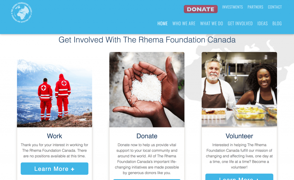
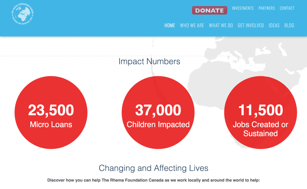
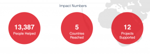
  • Created interactive scrolling stats as requested by the client. RF Canada Impact Numbers that scroll as they enter the viewing area

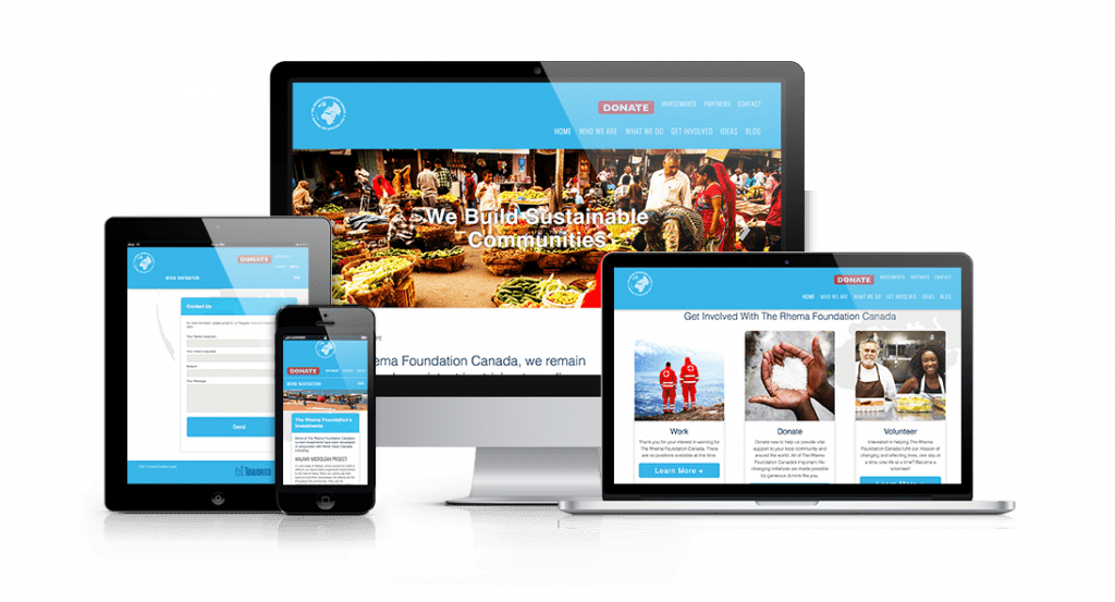
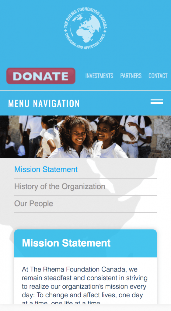
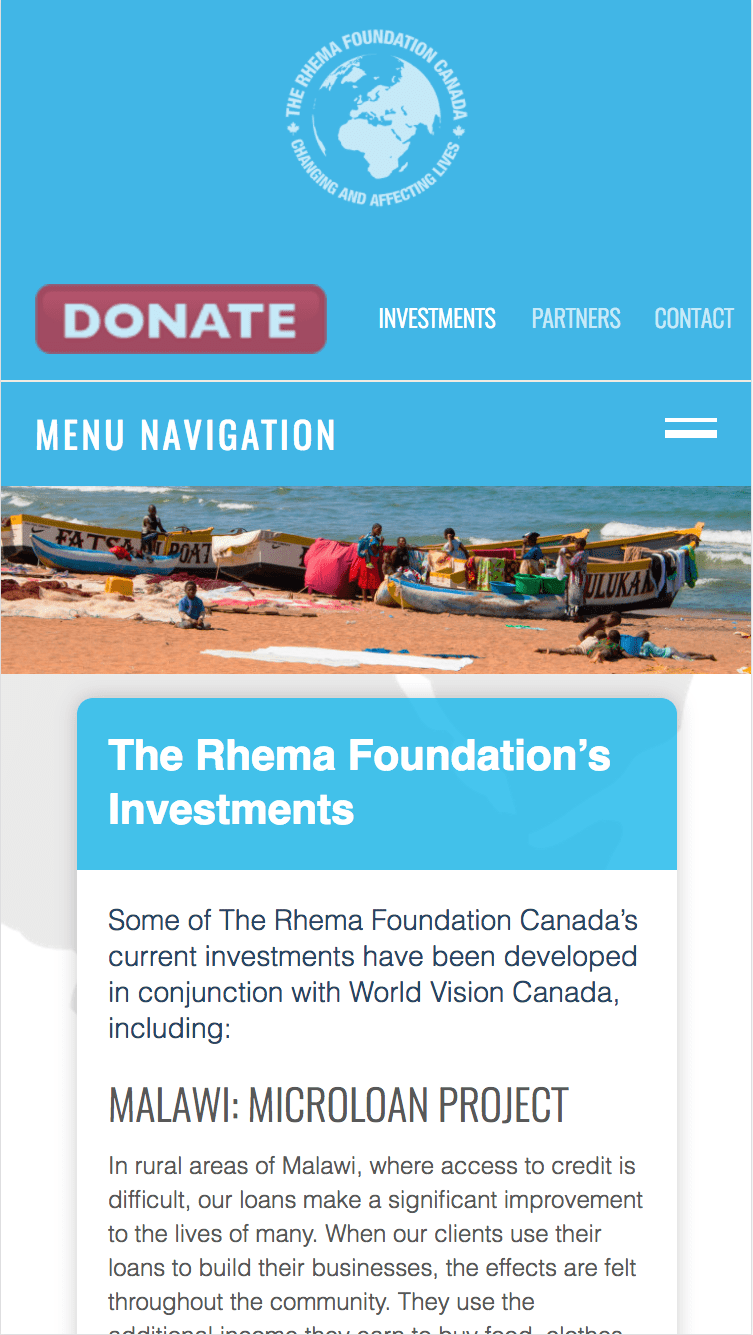
  • Ensured alignment of images and elements were functioning on desktop, mobile, and tablet. 

  • Handed over completed assets and control of site to client. 

Let’s Build a Website That Makes an Impact!