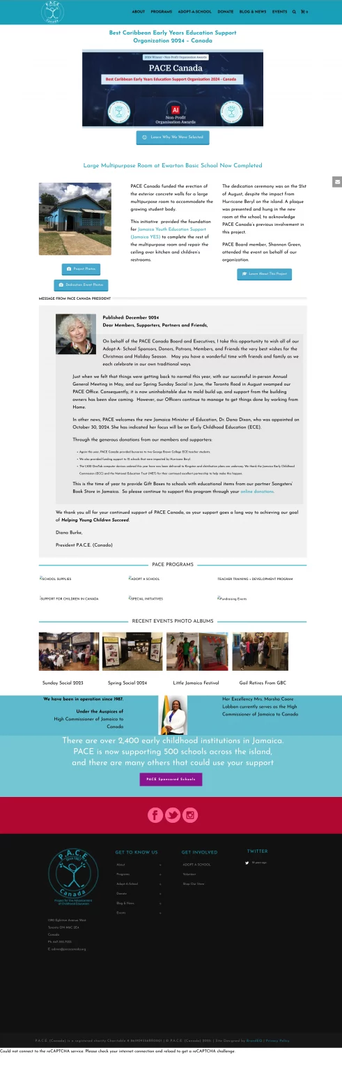
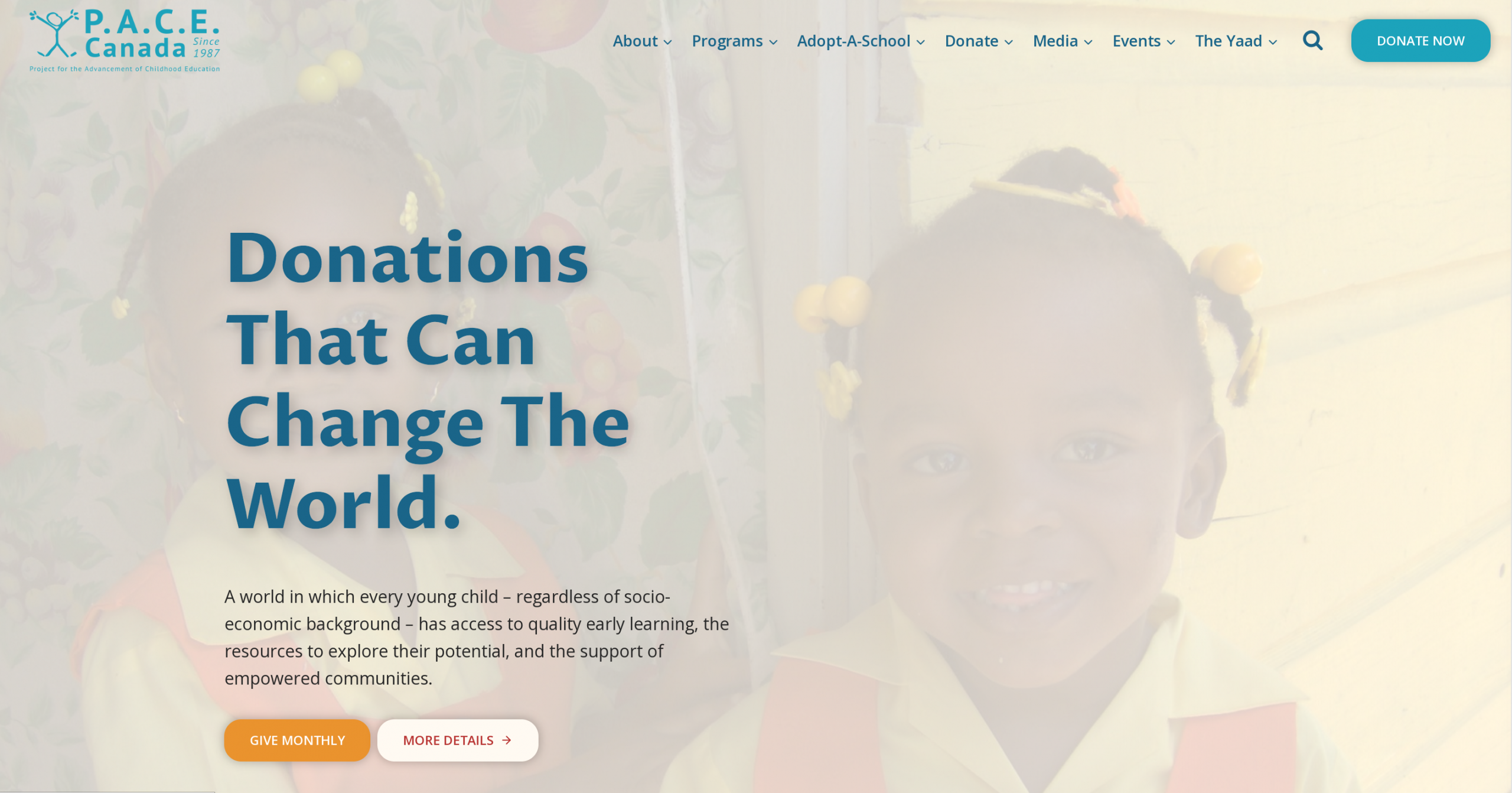
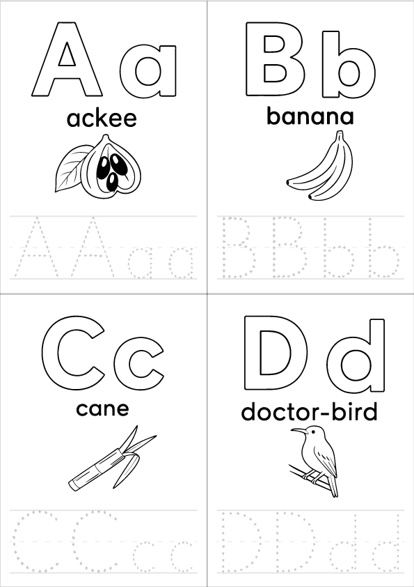
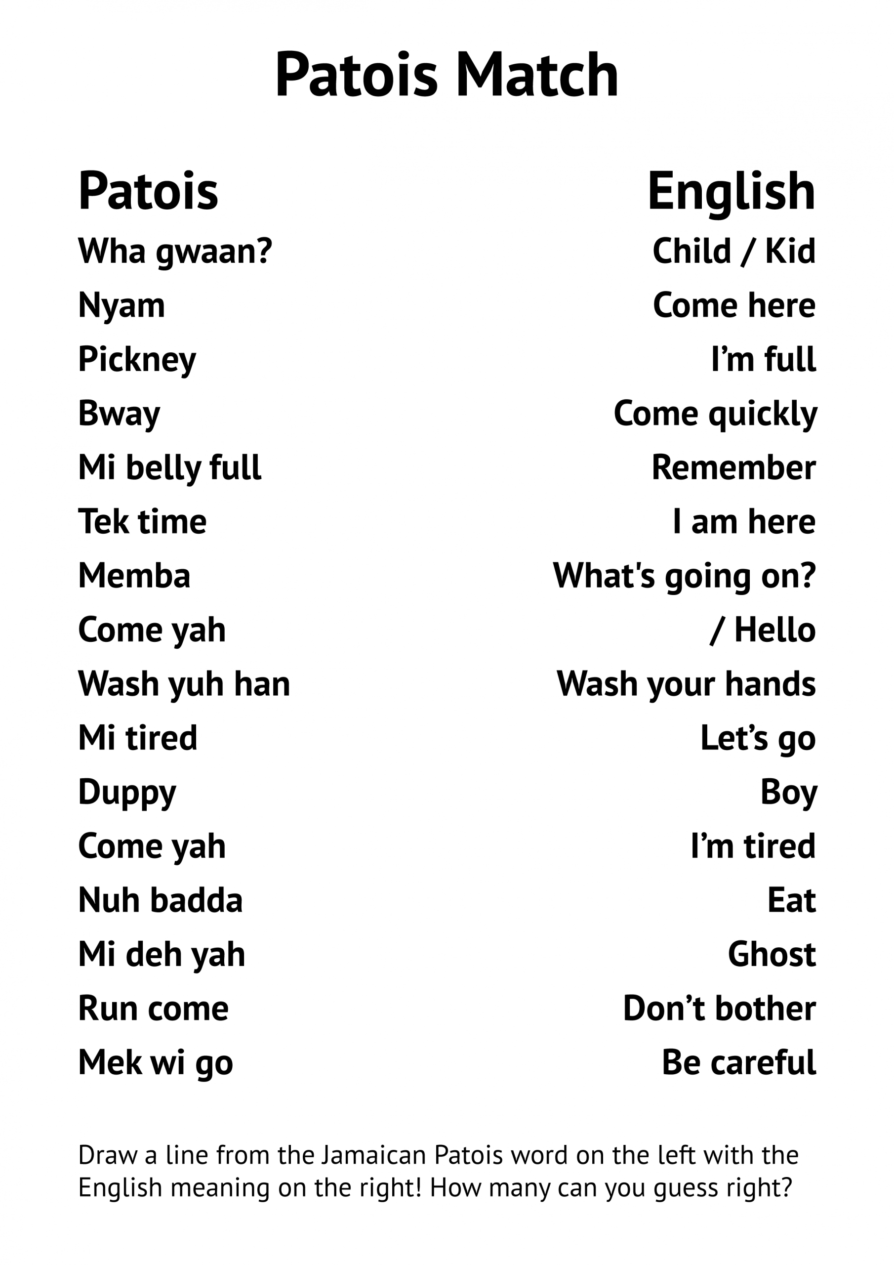
P.A.C.E. Canada needed a website that could better support the families it serves while making content easier to manage internally. The existing site had grown over time, creating navigation challenges, inconsistent layouts, and unnecessary friction around donations and key information.
The redesign focused on improving usability, accessibility, and long-term maintainability. Alongside a refreshed interface, the site was restructured with clearer information architecture, simplified donation pathways, and reusable page templates that allowed the organisation to manage content with confidence.
My Role
UX/UI Designer & Front-end Developer I led the project from discovery through implementation, including UX strategy, information architecture, interface design, accessibility improvements, WordPress development, and launch support. I also collaborated with stakeholders to ensure the final site balanced organisational goals with the needs of families and donors.
Challenges
The previous website had evolved organically over many years, resulting in inconsistent navigation, duplicated content, and unclear user journeys.
Key challenges included:
Simplifying navigation across a growing content library.
Reducing friction in donation pathways.
Improving accessibility for diverse audiences.
Building a flexible content system that staff could manage independently.
Tools Used
WordPress · Figma · Illustrator · Photoshop · Acrobat Pro
Information architecture, component-driven layouts, scalable content structure.
Solution
The redesign centred on creating a clear, accessible experience supported by a scalable WordPress framework.
This included:
Reorganising the site’s information architecture.
Streamlining donation journeys.
Designing reusable page templates.
Improving typography, spacing, and visual hierarchy.
Implementing accessibility best practices throughout.
Process
Audit: Reviewed existing site structure, navigation, and donation pathways to identify friction and SEO limitations
Architecture: Reorganized page hierarchy and top-level navigation to clarify resource access and reduce redirect dependency
Design Iterations: Completed four core layout refinements to improve visual hierarchy, consistency, and readability
Integration: Embedded donation-linked pages directly into the site experience to maintain continuity and domain stability
Accessibility: Applied spacing, contrast, and responsive structure aligned with AODA standards
Deployment: Built and launched a scalable WordPress system with structured templates and internal training
Results
Clearer navigation and improved usability
Embedded donation experience with reduced friction
Improved SEO continuity
Strengthened stakeholder positioning
100 percent trilingual resource delivery
Sustainable, self-managed system live since Summer 2025
Client Feedback
“It has been a pleasure to work with you. The changes made have implemented a new and very improved website that reflects our organization’s work. We greatly appreciate the attention to detail.”
— Mark, PACE Canada
Dive Deeper into the Process
Information Architecture
Navigation was rebuilt to surface high-priority content and reduce friction across donation and resource pathways. Content hierarchy was simplified to support both families seeking help and donors looking to contribute.
Donation Integration
External donation-linked pages were embedded directly into the site experience. This reduced redirection, maintained domain continuity, and supported stronger SEO performance.
Accessibility
Spacing, contrast, and responsive structure were refined to align with AODA standards. The layout prioritizes readability and clarity across desktop, tablet, and mobile.
Sustainability
The site was delivered as a self-managed WordPress system with structured templates and internal training. The organization now maintains content independently with only occasional refinements post-launch.
Like this design direction? Let’s build something impactful together.